How to Create Perfect Color Combinations in Interior Spaces
Enchant with Colors: How to Create Perfect Color Combinations in Interior Spaces
The power of colors is immense; they can completely transform a space. When the right color combinations are used, an interior space can become both visually striking and functional. However, poor color choices can make a space appear chaotic and overwhelming. In this blog post, we at KAAN Architecture present a comprehensive guide to help you create perfect color combinations for your interior design projects.
1. Understanding the Color Wheel: The Essential Step
The color wheel is the most fundamental tool for creating harmonious color combinations. The wheel features primary colors (red, yellow, blue), secondary colors, and tones. Here are some basic combinations you can use based on the color wheel:
Triadic Combinations: Colors that are evenly spaced on the color wheel (e.g., red, yellow, and blue). These offer an energetic and harmonious feel.
Complementary Colors: Colors that are opposite each other on the color wheel (e.g., blue and orange). These create a dynamic and eye-catching atmosphere.
Analogous Colors: Colors that sit next to each other on the color wheel (e.g., green, blue-green, and blue). These create a calm and balanced environment.
2. The Psychology of Colors: What Feelings Do You Want to Evoke?
The psychological impact of colors on people should always be considered.
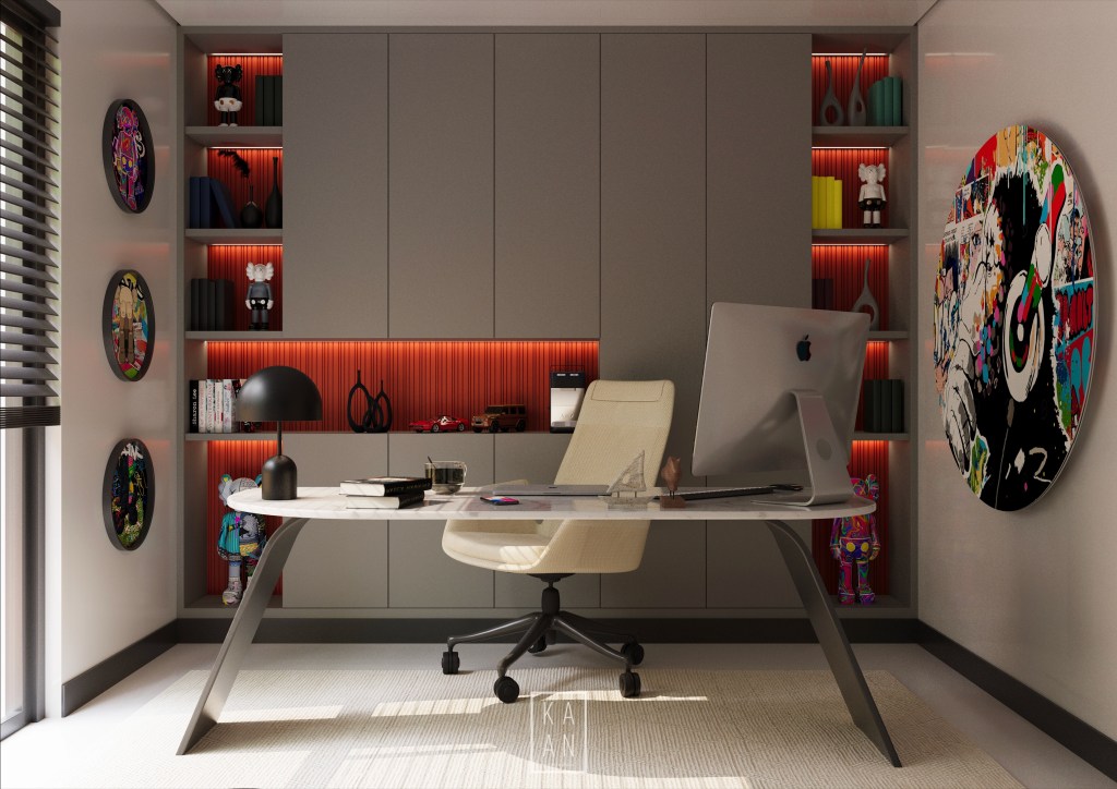
Neutral Colors: Tones like white, gray, and beige provide a timeless and minimalist look. At KAAN Architecture, we often use these colors to add a modern touch to our designs.
Warm Colors: Colors like red, orange, and yellow evoke energy and warmth. They are ideal for living rooms or dining areas.
Cool Colors: Shades of blue, green, and purple convey peace and relaxation, making them suitable for bedrooms and bathrooms.
3. Color Proportion: Use the 60-30-10 Rule
To achieve a balanced distribution of colors, you can apply the 60-30-10 rule:
- 60% Primary Color: This is the main color of the space (e.g., walls).
- 30% Secondary Color: These are supportive elements such as furniture and textiles.
- 10% Accent Color: Small but impactful touches added through accessories and decorative items.
This rule is key to achieving a cohesive and aesthetic appearance in interior design projects.
4.Consider Natural Light
Always evaluate how natural light interacts with a space when choosing colors. In rooms with abundant natural light, even dark colors can work harmoniously, whereas lighter colors are a better choice for dimly lit spaces. At KAAN Architecture, we prioritize optimizing natural light in all our projects.
5.Popular Color Combinations
Here are some successful color combinations frequently used in interior spaces:
- Black and White: A timeless and sophisticated contrast.
- Blue and Beige: Creates a serene coastal vibe.
- Gray and Yellow: Offers a modern and energetic look.
- Green and Wooden Tones: Evokes a natural and inviting atmosphere.
At KAAN Architecture, we effectively implement these combinations to bring a unique touch to your spaces.
6.Enhance Colors with Textures and Materials
You can add depth to a space not only through colors but also by using different materials and textures. For example, combining matte and glossy finishes can amplify the impact of colors. In your interior design projects, such details can elevate the aesthetics to the next level.
7.Reflect Your Personal Style
Finally, ensure that the colors used in a space reflect your tastes and lifestyle. While it’s tempting to follow trendy colors, prioritize tones that are meaningful and enjoyable for you. At KAAN Architecture, we focus on creating unique spaces that prioritize the preferences of our clients in every project.
Choosing the right colors can transform a space from ordinary to extraordinary. By following the tips above, you can create color combinations that balance both aesthetics and functionality. Remember, in interior design, colors are one of the most powerful tools—learning to use them correctly is an art.
